Brand identity in motion: recognition over time.
A brand is experienced through a sequence of moments, not only a still logo. We explore how an existing identity can behave in motion — how it arrives, moves between scenes and remains recognisable across different applications.
Begin with the identity that already exists.
The starting point is the brand: its logo, typography, colours, imagery and tone of communication. We look at the relationships between those elements and ask what should carry into animation. The aim is to extend what makes the brand recognisable, rather than adding movement with no connection to its visual language.
This can lead to quite different outcomes. A precise identity might call for measured timing and controlled camera movement. A more energetic brief might invite rapid transitions or a stronger sense of momentum. We discuss the intended character before choosing how the graphics should move.
Turn visual characteristics into motion principles.
Motion introduces another set of design decisions: duration, acceleration, direction, sequence and the relationship between elements. We explore these through short tests. A logo reveal can become a useful starting point, but the wider question is how the same character could inform transitions, typography and product imagery.
We look for a small set of behaviours that work together. These might include the way shapes assemble, how a camera approaches an object or how colour appears across a sequence. The principles should be specific enough to recognise and flexible enough to support more than one animation.
Connect the brand to the subject.
The context of the communication matters as much as the identity itself. For a sports broadcast, movement can reflect the pace and direction of the sport. For product communication, materials, packaging and composition may be the strongest connection to the brand. We develop the motion around that relationship.
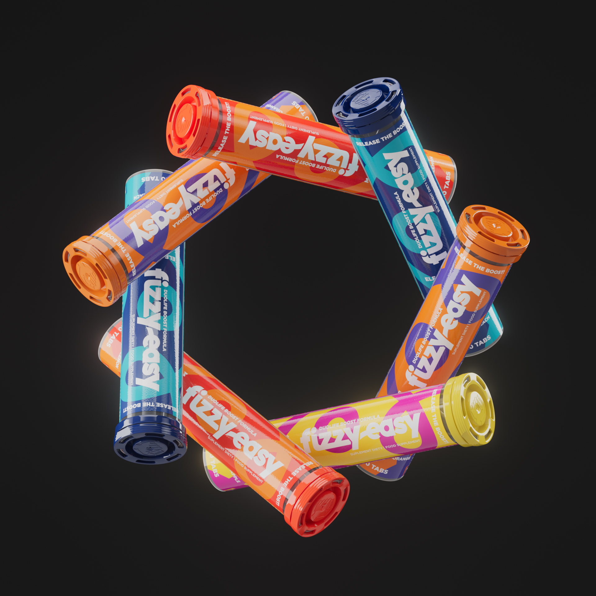
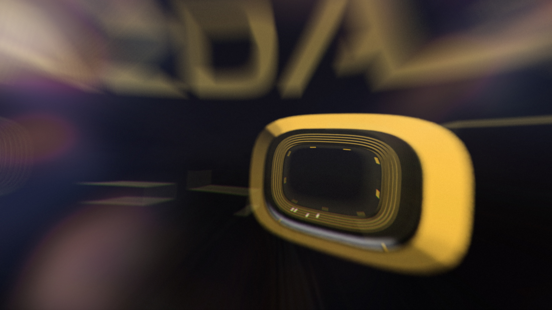
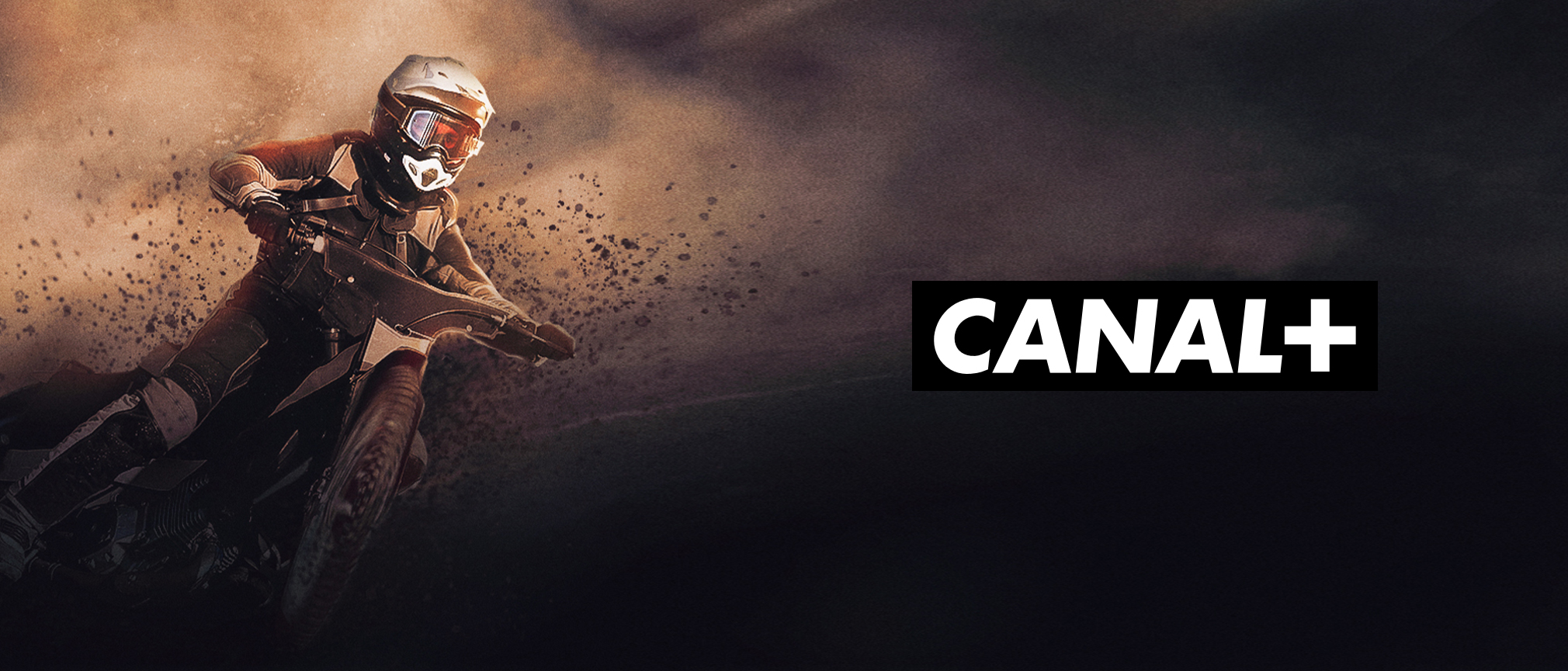
In the CANAL+ speedway project, a familiar channel identity is connected to track-inspired forms and a fast-moving 3D space. In the DuoLife work, the relationship grows across packaging, product imagery and campaign animation. These are different applications of the same question: what makes the result feel like it belongs to this brand?
Build consistency across the actual touchpoints.
A motion identity needs to work where the brand communicates. That could include a website, product launch film, social post, presentation or event screen. We discuss those placements early so that compositions, durations and graphic information fit the intended use.
Consistency does not require identical animation everywhere. A longer introduction has a different task from a quick scene transition. What connects them is a shared visual behaviour: recognisable timing, a related use of space and a consistent treatment of the brand assets. Keeping those relationships clear makes the individual pieces feel like part of one family.
The approach, in practice.

Let’s give your idea form.
To discuss brand identity in motion, share your current identity guidelines, existing assets and the situations where animation will be used. We can then explore how the brand should behave, which applications are needed and how to keep them connected.
Talk to ILMA